
Table of Contents

Data visualization

Introduction

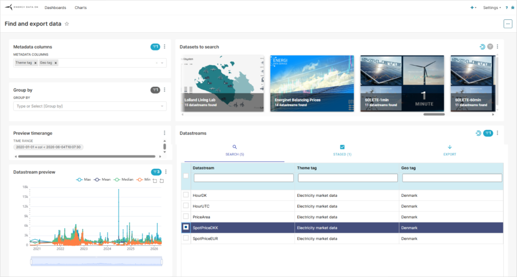
Visualization of data from EnergyDataDK can help you determine whether the data has gaps, assess the quality of the data, be utilized to monitor whether datastreams fall outside of tolerances, for demonstration purposes, ect.

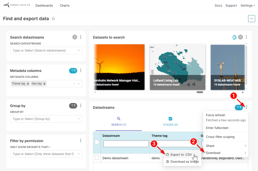
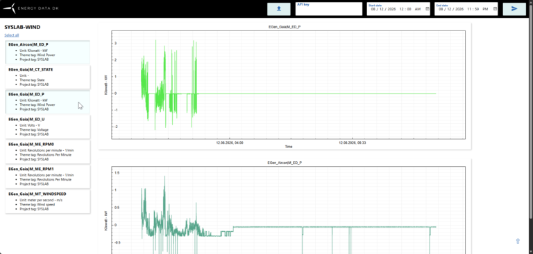
EnergyDataDK has built-in functionality that helps you do this; Simply select a dataset you have viewing rights to, select a datastream, and enter a time range to get a preview. This will help you assess whether this time period has data, and whether there are any gaps.
You can find detailed instructions in our Platform Guide.

You can use our APIs to extract data and use a variety of options to present the data visually.
Below we will provide instructions, examples, and perhaps even some inspiration. 

If you encounter any errors in this document or have suggestions for improvement, please contact us at EnergyDataDK@DTU.DK.

Visualization applications

There are a number of 3rd party visualization applications available which allow you to generate graphs based on either historical, or live data.

Many data visualizing applications can be used free of charge, are relatively easy to use, and you can usually get started within just a few minutes.

Grafana

Grafana is an open-source analytics and visualization web application. It connects to time series databases and other data sources, allowing users to build dashboards that display metrics, logs, and traces.

Wikipedia

Grafana is powerful and easy to use Open Source data visualization tool, which means you can use Grafana for free.
You can find it here.

Installing Grafana is relatively straight forward, so for the purpose of this guide we’ll assume you’ll be able to get started with Grafana by following the steps involved with the registration process.

Live data monitoring

In this example we’ll connect Grafana to a datastream by subscribing to it using the EnergyDataDK MQTT broker.
To do this, you must ensure the following:

  • You have access to the datastreams which you want to visualize.
  • You have an API token which grants “Connect to mqtt and read / write data in realtime” permission for the datasets which contain the datastreams you want to visualize.
The MQTT data source plugin

First and foremost, you’ll need to install the “MQTT data source plugin.

Select  Administration → Plugins and data → Plugins from the main menu on the left.

In the Search field enter “MQTT” and click the MQTT tile.

Click the Install button in the upper right corner.

Establish the connection

Next, we need to establish the connection to the datastream.

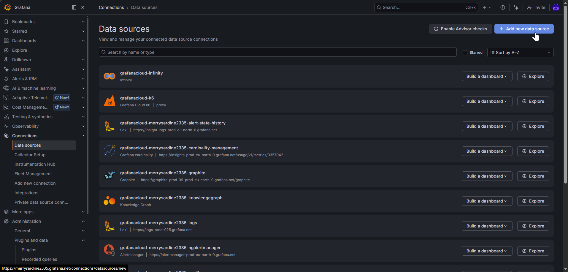
Select Connections → Data sources from the main menu on the left and click the Add new data source button in the upper right corner.
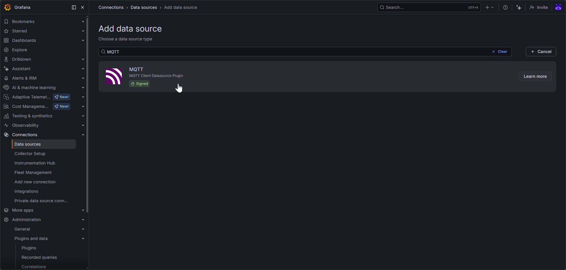
In the search field enter “MQTT” and click on the MQTT tile.
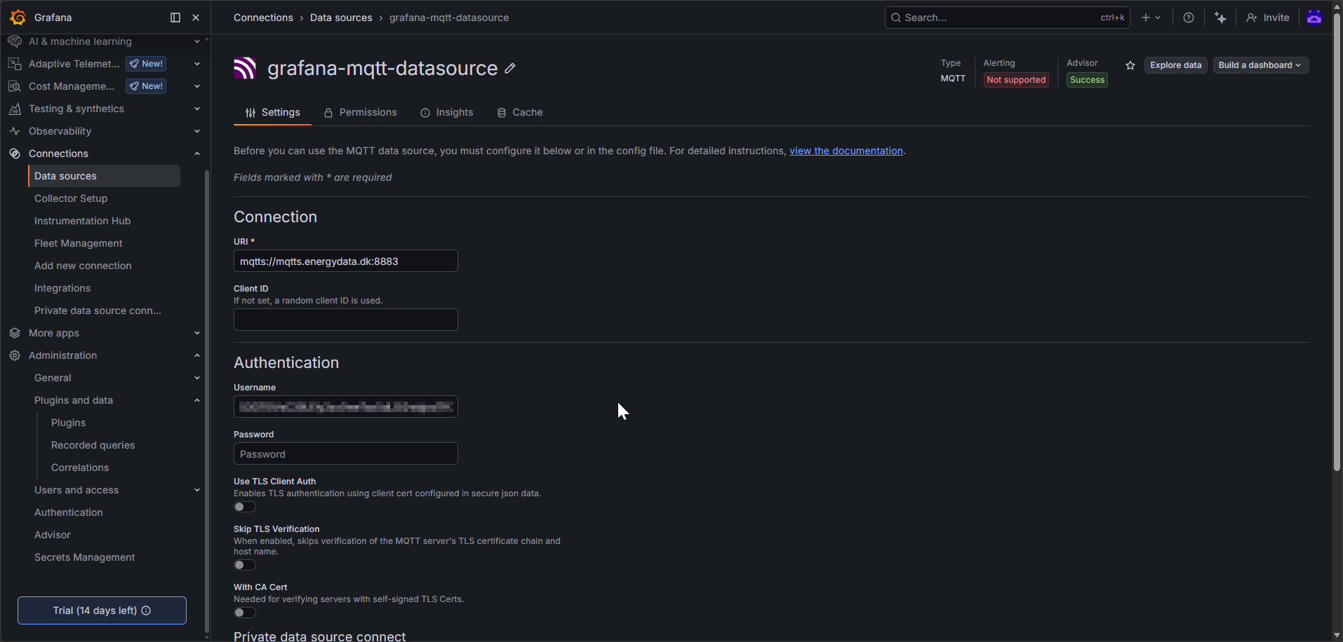
You can now configure the data source. To do this, follow these steps:
  1. Under the Connection section, in the URI field, enter “mqtts://mqtts.energydata.dk:8883”.
  2. Under the Authentication section, enter your API key in the Username field.
  3. Leave the Client ID and Password fields empty.
  4. Press the Save and test button.
You should get a “MQTT connected” message. If you have an invalid API key, you’ll get a “error connecting to MQTT broker: not Authorized” message instead.
Create a dashboard

Now that we have a connection, it’s time to actually visualize the datastream.

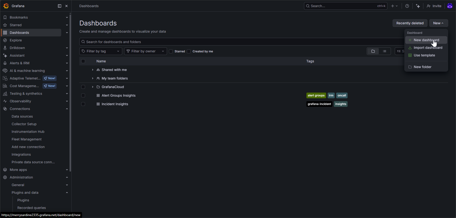
Select Dashboards from the main menu on the left, press the New button in the upper right corner, and select the New dashboard option.
Enter “MQTT” in the search field and select the MQTT tile.
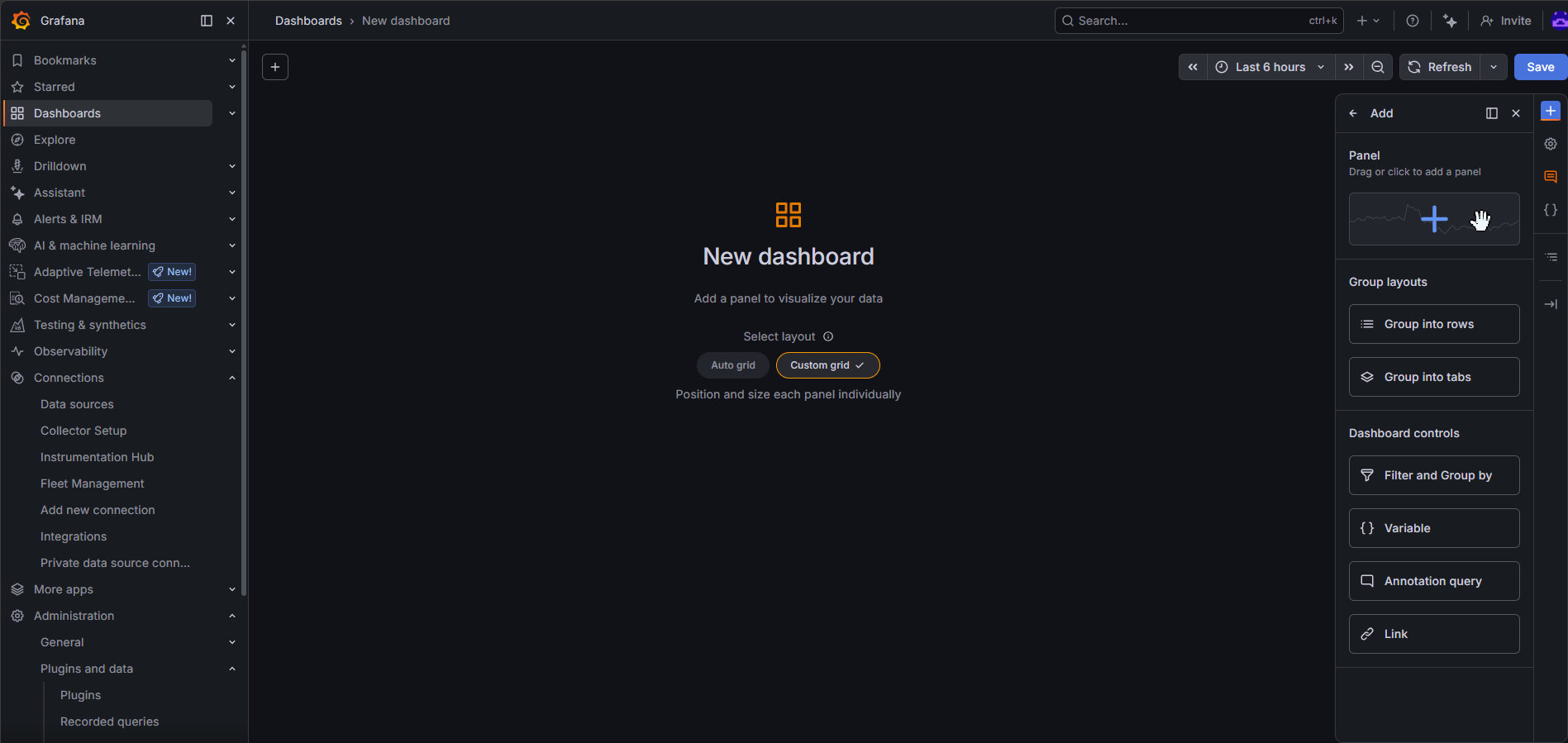
Click or drag a pane from the menu on the right to the grid in the middle of the screen.
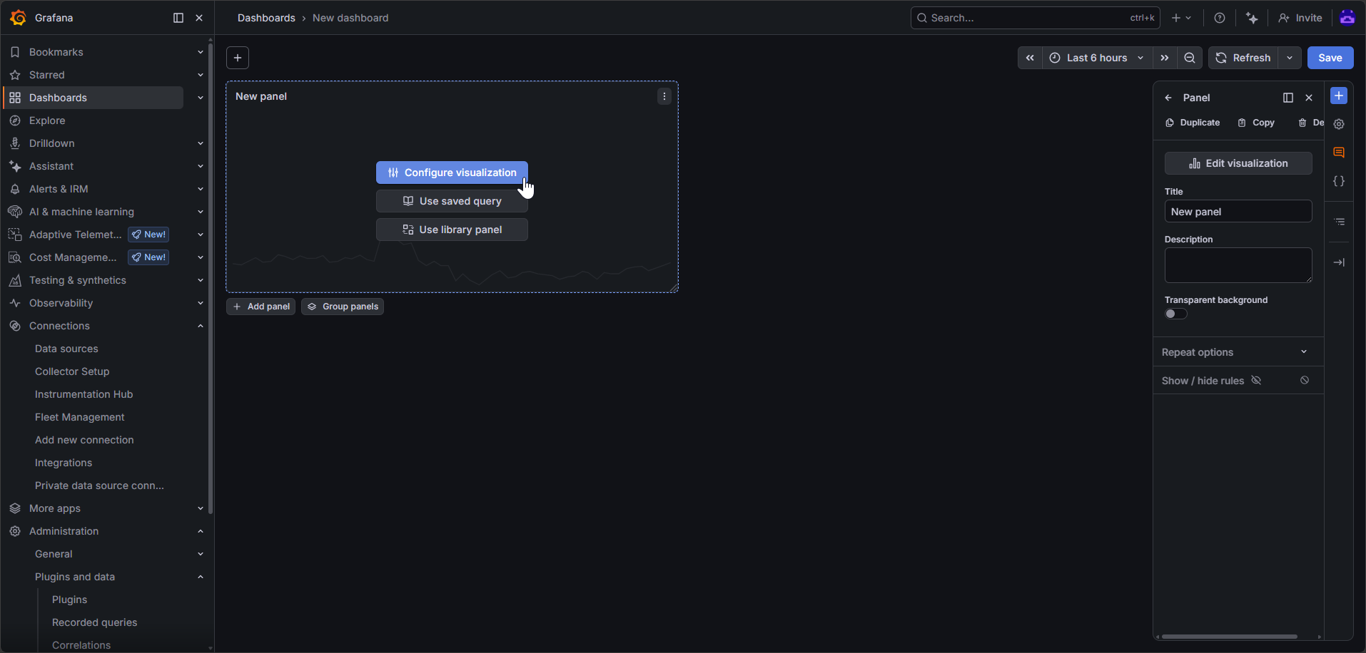
Press the Configure visualization button.
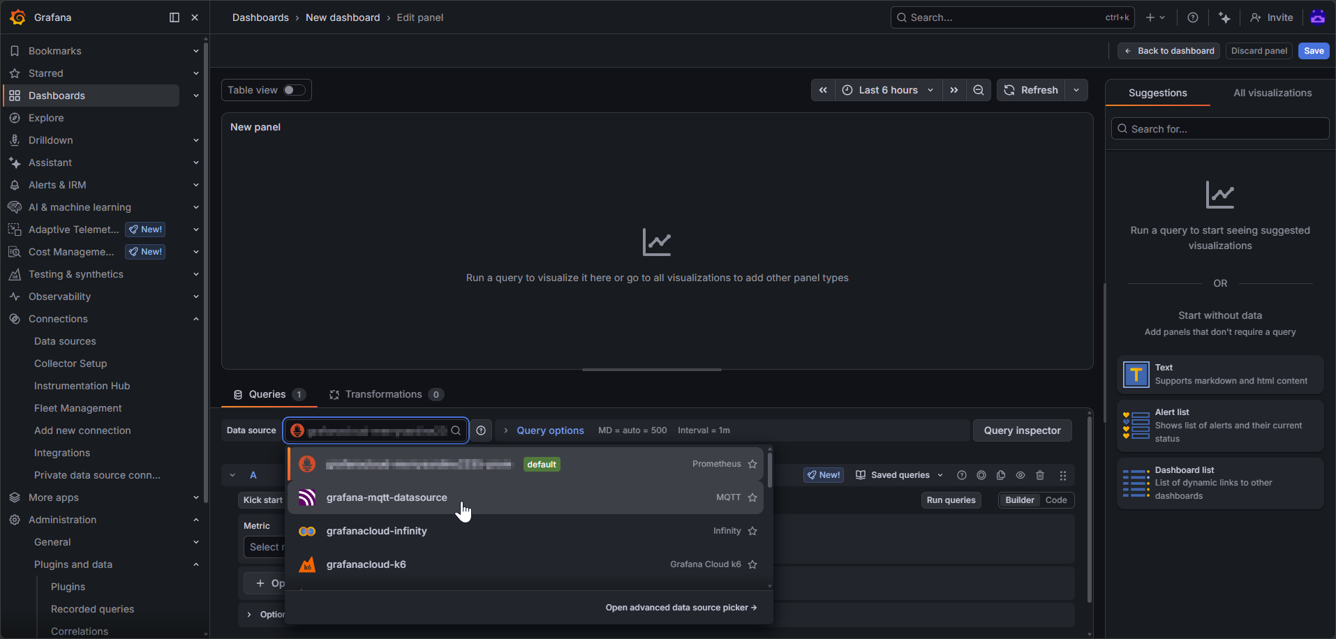
Select the grafana-mqtt-datasource option from the Data source field.
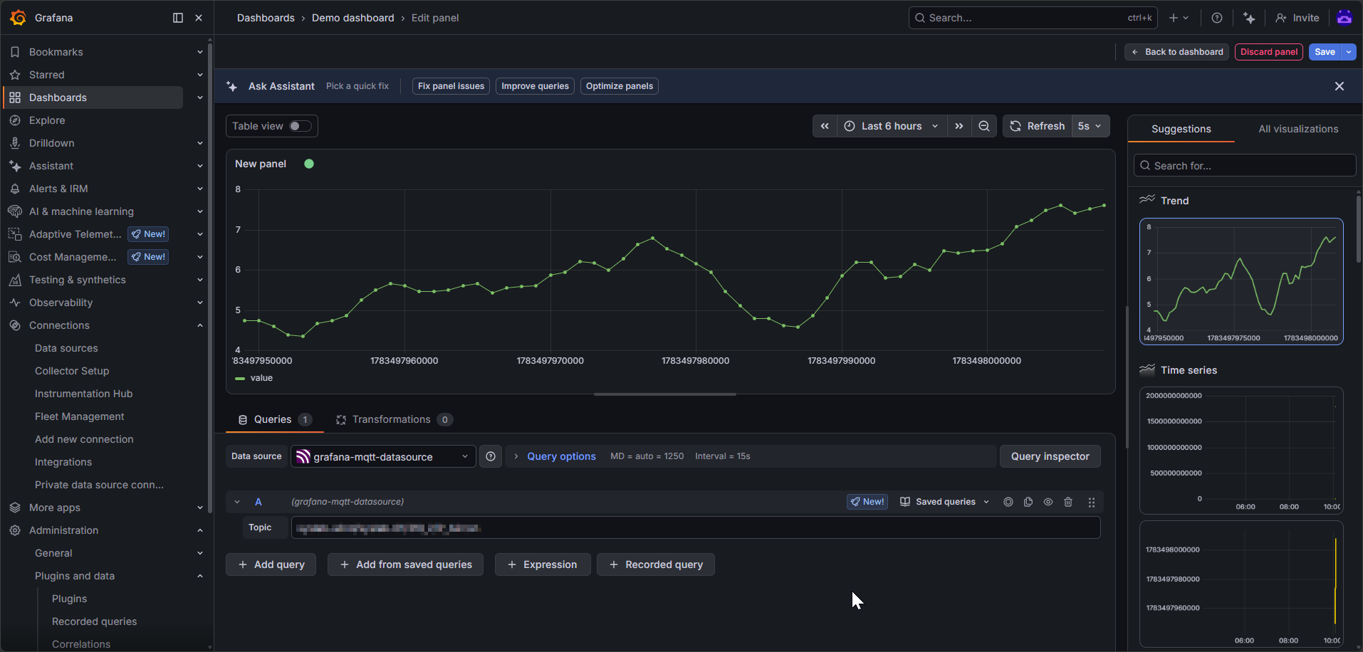
In the Topic field, enter your full MQTT topic (both the prefix and the suffix), for example: dataset/datastream-collection/datastream. You should now see a graph generating.
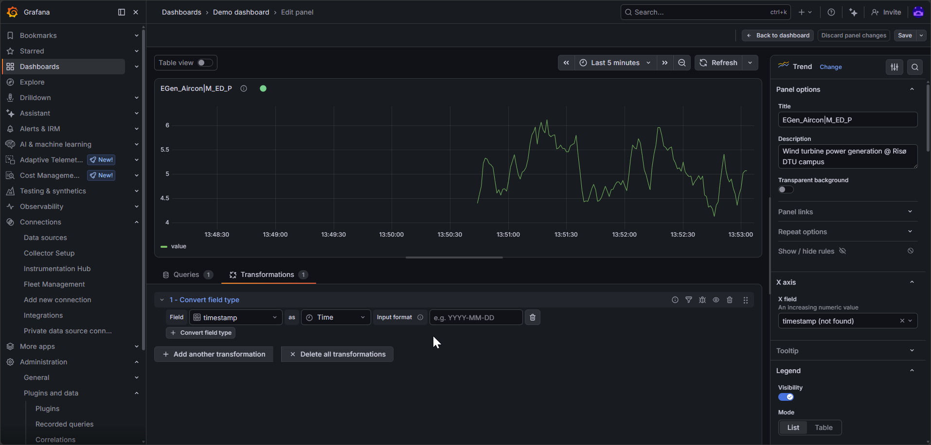
You may notice that the x-axis displayed Unix timestamps, which doesn’t make much sense to us, so we’ll need to convert this to something we can understand. You can achieve this as follows:
  • In the menu on the left, under X axis, in the X field, select timestamp.
  • Near the bottom of the screen, on the left side, switch to the Transformations tab.
  • Select timestamp and Time in the two input fields.
After making making your changes and modifications, press the Save button to save your panel, and press the Back to dashboard button. You can add more panels to suit your needs.